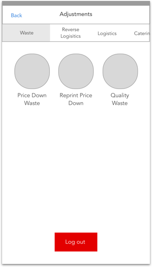
The Brief
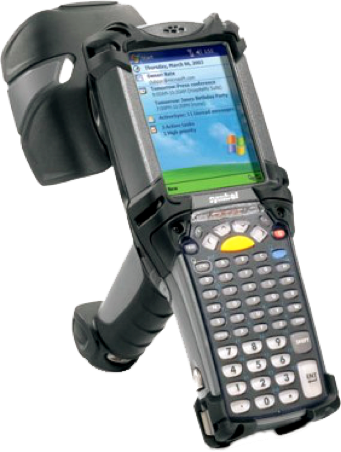
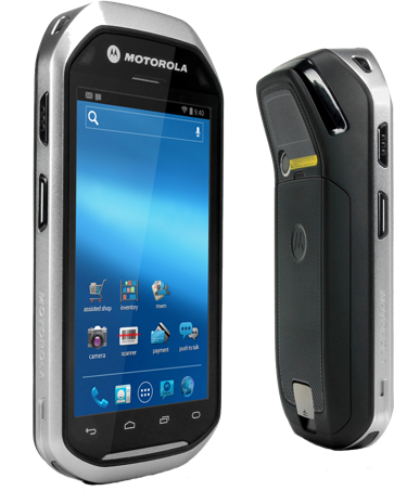
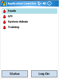
In all M&S stores around the country, staff in a variety of departments inside the store use HHT devices to deal with a variety of jobs inside the store. The problem was that these devices were not only difficult to use & dated, support for these devices was coming to an end soon & it was time to move to a completely new device. I was brought in to completely redesign the UX & UI for all the apps staff use in different departments.
The Current Experience

Understanding the Audience

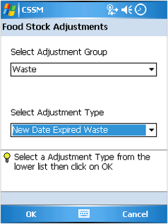
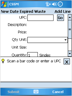
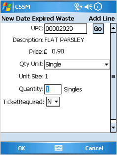
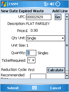
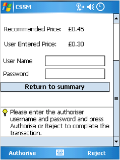
Very long process to do a simple task, using the stylus for selection was difficult on these screens, as the selectable area was very small. App hints constantly popping up added more work as we have to close it before we can actually input the information.
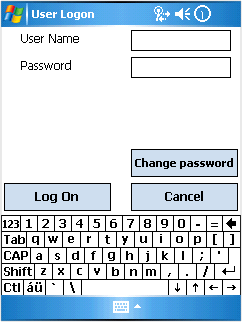
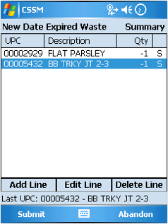
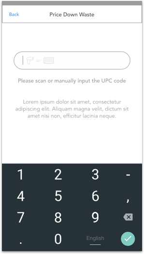
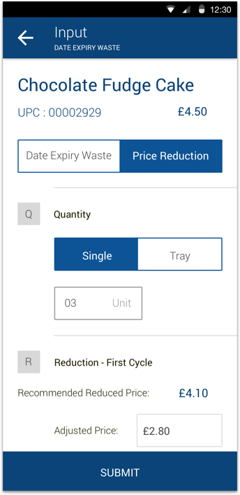
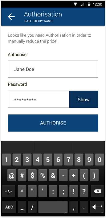
Annoying process of having to input your login credentials using a stylus and a tiny keyboard after the device goes to sleep. Drop downs were difficult to use and took up quite a lot of time to select the option you want. The summary list can get quite confusing as it only shows one line of information about the product you scanned in.


Device is very heavy, usually have to scan a product, put the product down then use two hands to go add all the details I need to. Takes a while to add the information as most of our HHT devices no longer have the stylus so we have to use a pen on the screen to input information.
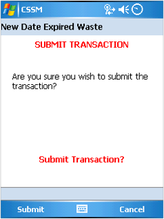
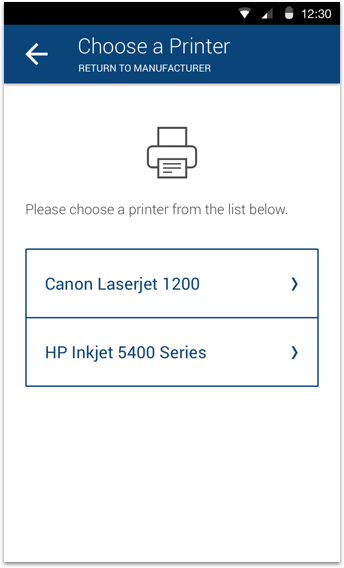
Once you are in an app, you are stuck in there until you submit , but there has been many occassions where I have come accross an item that needs to bereturned to manufacturer& would have to leave it to one side until all other products have been submitted before I can RTM that product.

Goals & Requests
The main goals for these new revised apps for M&S staff is to make their daily tasks easier, more efficient. At the same time familiar as they had a huge number of staff across all the stores in the U.K. all with a variety of tech savviness & not enough budget for training existing staff as well as new staff.
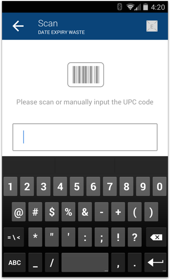
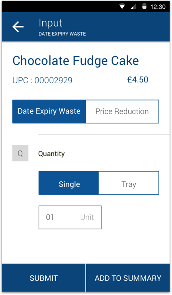
Sketch Wireframes
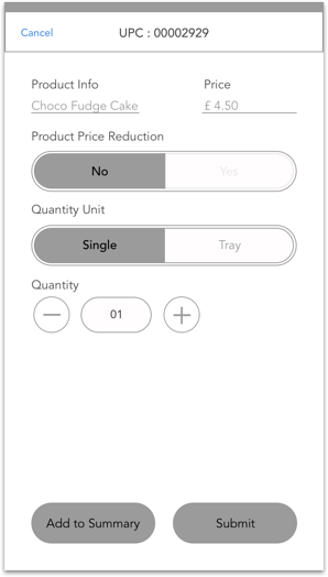
I started sketching ideas for the revised UX flow as well as new screen layouts with only the essential information needed. Keeping in mind the problems staff currently face.
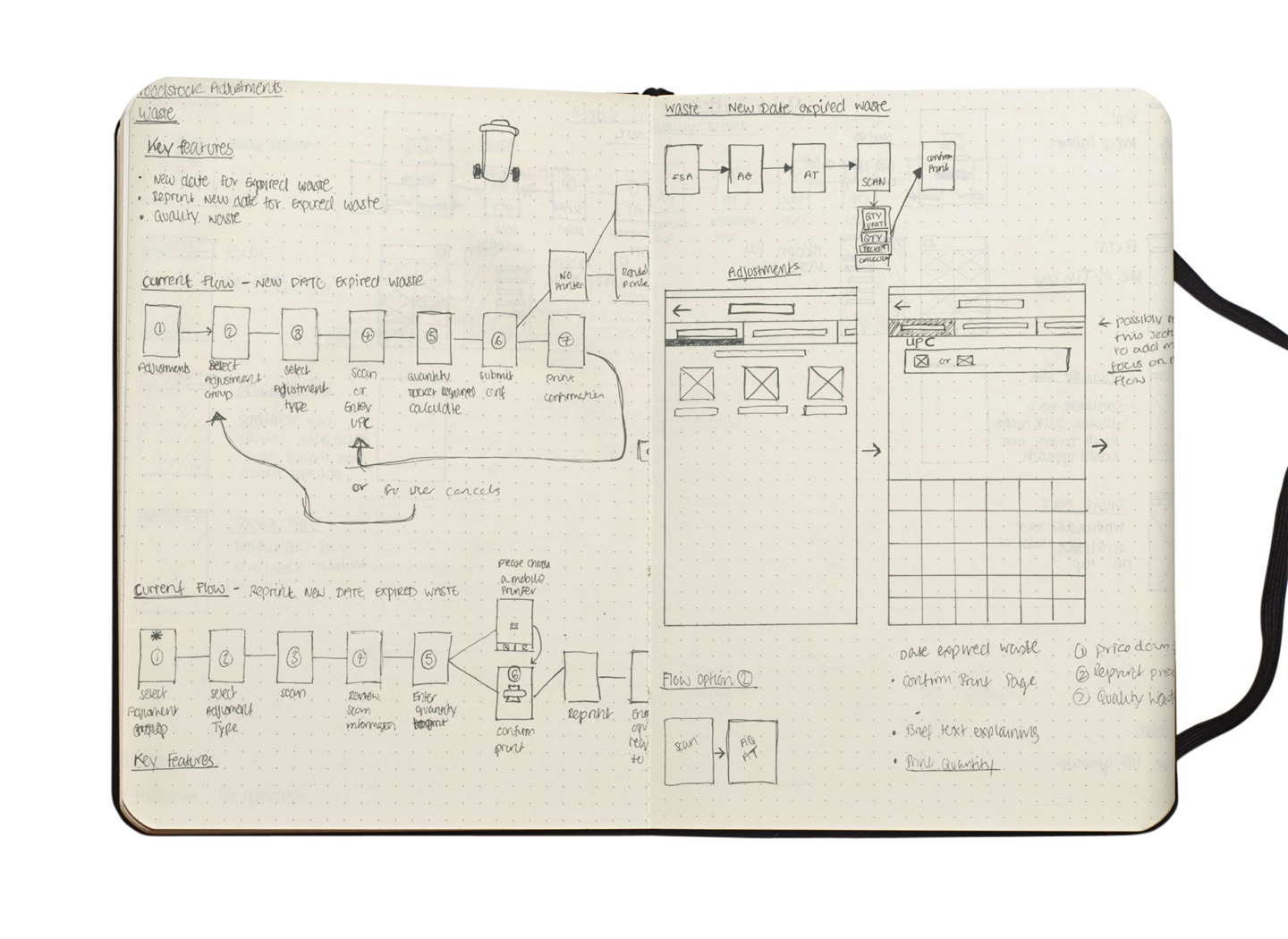
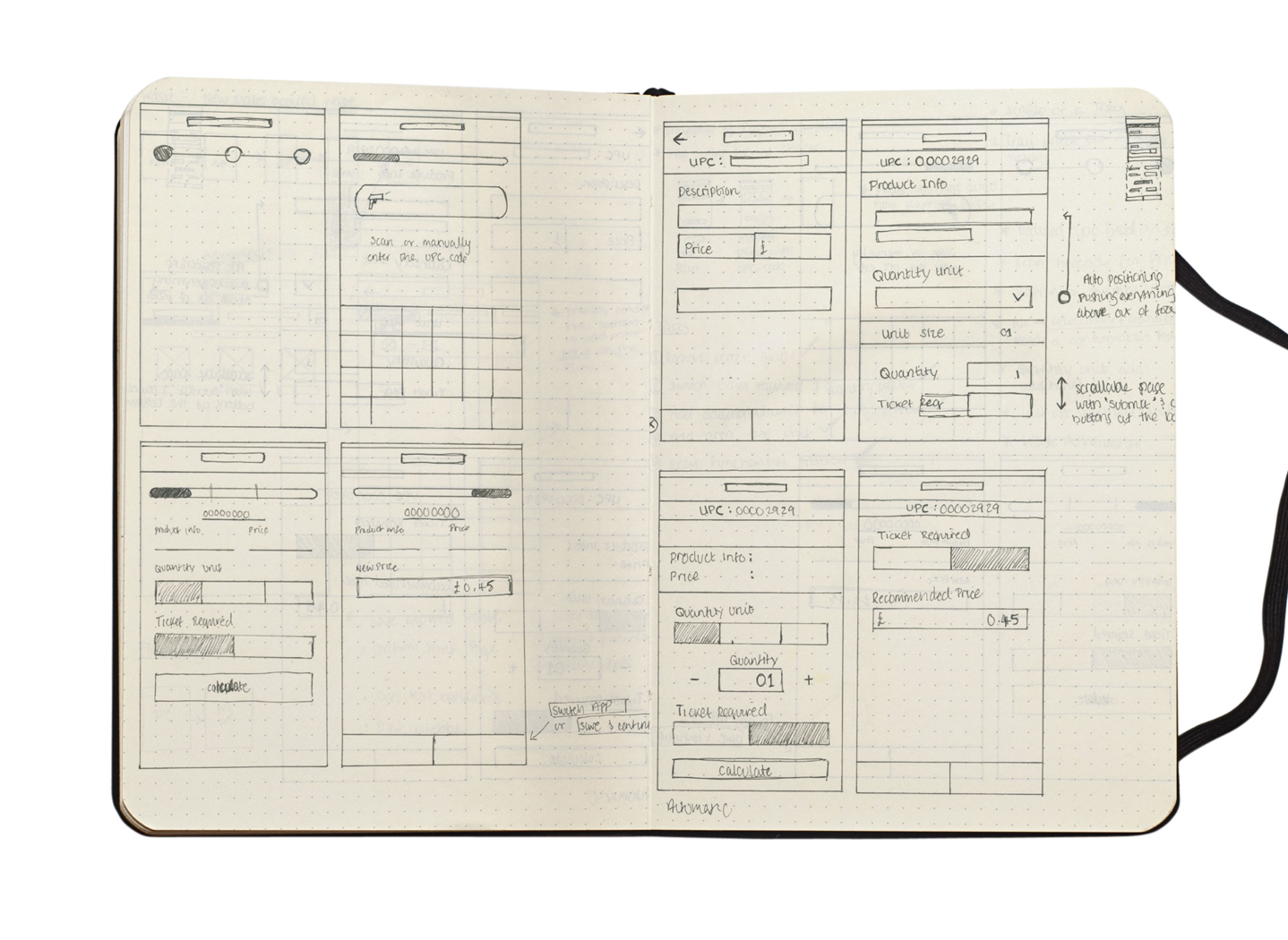
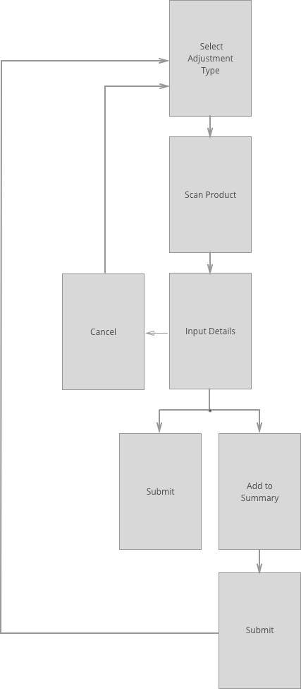
New UX Flow


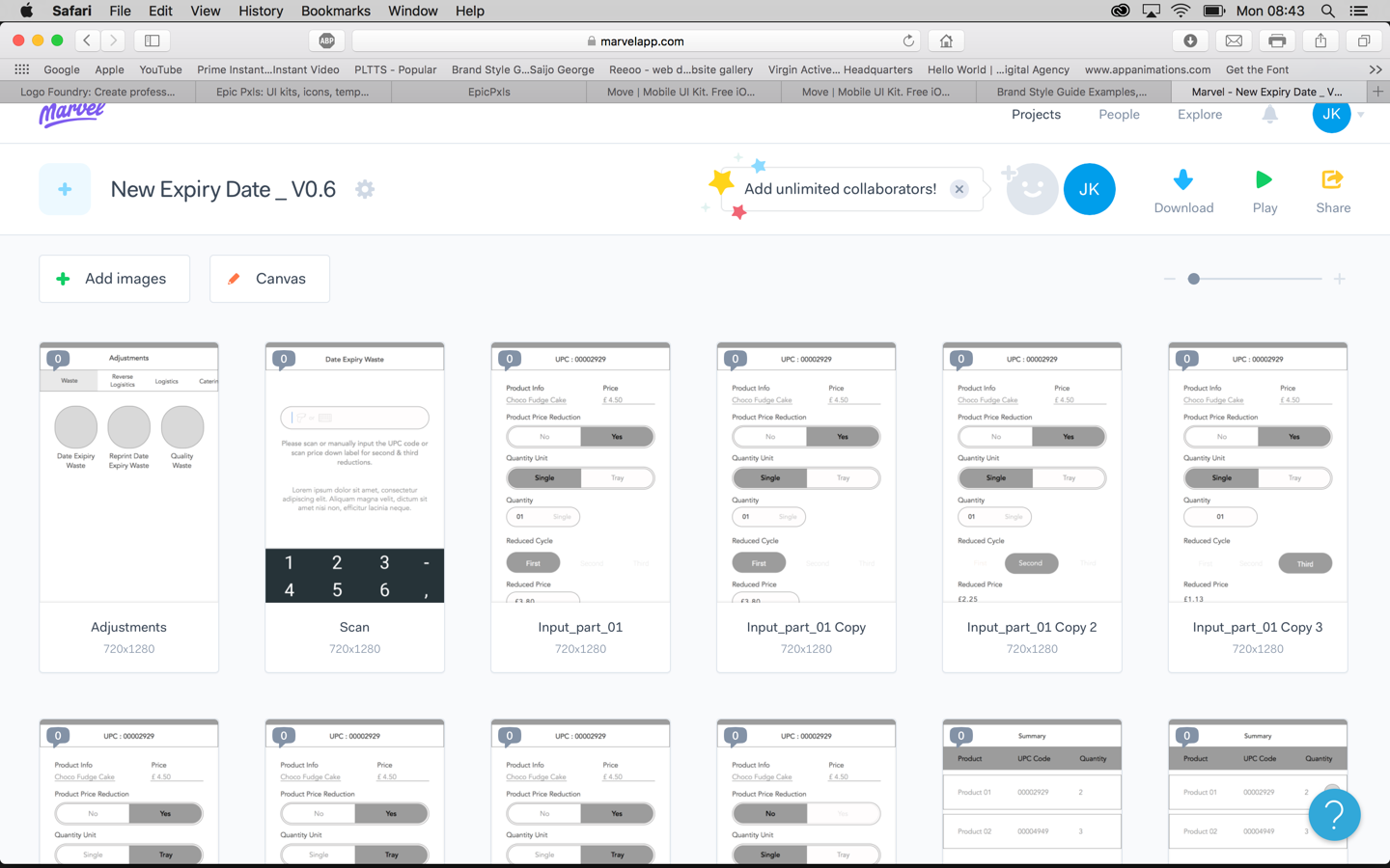
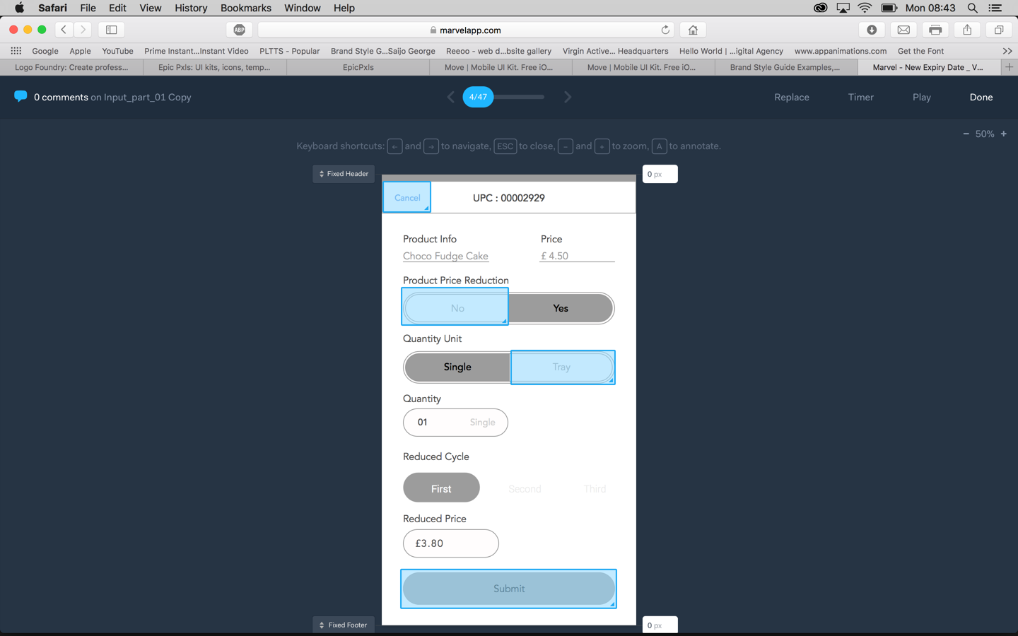
Marvel Prototype
Feedback from User Testing

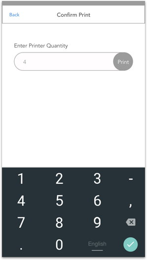
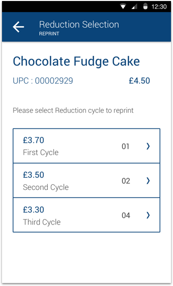
Text size needs to be slightly bigger, especially on the product information and price section. Selected state isn’t as easily identifiable as it should be. Reprint part of the app works really well but I would slow down the printer connection flow.
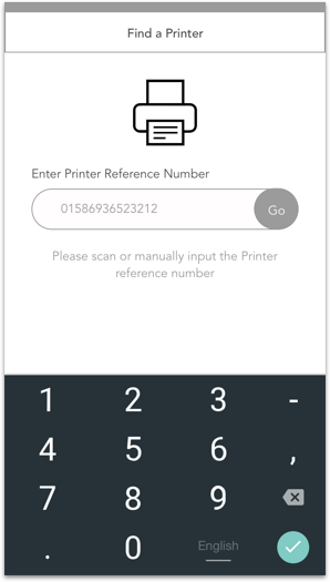
The layout is perfect, everything is right where you need it and buttons are easily tappable. I would recommend using a bigger text size throughout. Reprint ticket is really easy to use. Would be great to have the ability to add multiple supply numbers.


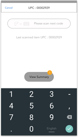
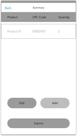
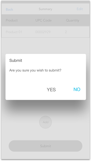
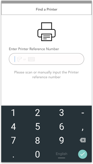
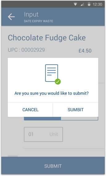
Much better and faster than the old way of working, I like how the information is shown in the summary section. Editing and submiting the summary is very easy. With the Reprint, I sometimes don’t have a portable printer on me, so would usually have to find and send it to a desktop printer via the network. Would be great to be able to view all available printers in my store.
Iteration & Feedback
User Interface
First Release
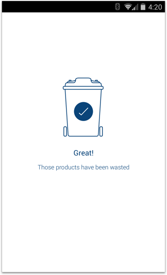
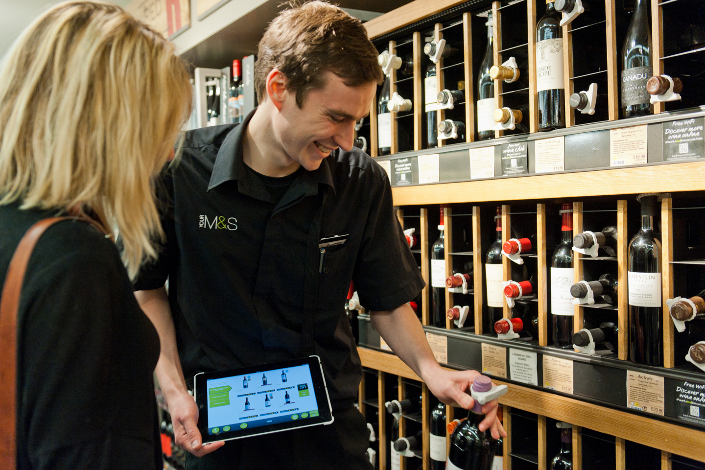
The first release of the enterprise apps were launched in the UK’s biggest M&S store in Kew Gardens, then followed by Epsom and the rest of the stores. M&S Staff are really happy with the new devices & the apps we delivered, Staff reported that jobs around the store that would usually take half a day could now be done in less than 30 minutes.
We continued to produce 40 small applications for the different departments inside of M&S over 4 months.